The IQNOX Checkbox is a simple widget that shows a checkbox that can be ticked by a user.
Usage #
Properties #
| Property | Type | Binding | Default | Description |
|---|
| CustomClass | STRING | <> | | Enables you to define an html class to the top div of the widget. Multiple classes can be entered, separated by space |
| Template | LIST | < | Template1 | The widget Template to use for this widget |
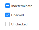
| State | BOOLEAN | <> | FALSE | When selected, the checkbox will show as selected and output TRUE. |
| Indeterminate | BOOLEAN | < | FALSE | Indicates that the state is indeterminate. Neither Checked or Unchecked. |
| Disabled | BOOLEAN | < | FALSE | Disables the checkbox so it can’t be clicked to change its state |
| Label | STRING(localized) | < | Label | The text that is displayed above the input/textarea |
| TabSequence | INTEGER | | 0 | Specifies the tab order of an element (when the “tab” button is used for navigating) |
| ShowHelpIcon | BOOLEAN | < | FALSE | Will enable a customizable icon on the right of the label, the icon will show the tooltip on hover for more documentation |
| HelpIcon | STRING | < | | Icon to be displayed on the right of the label when ShowHelpIcon is enabled. |
| Tooltip | STRING(localized) | < | | Optional tooltip used to display additional information. See Tooltip |
| TooltipAnchor | STRING | | Widget | If the tooltip should appear next to the Widget, or next to the cursor. |
| ToolTipFormat | STRING(localized) | < | | see Format Complex |
| TooltipType | LIST | < | Text | The widget tooltip type |
| TooltipMashup | MASHUPNAME | < | | Mashup to be used as a tooltip when TooltipType is set as Mashup |
| TooltipWidth | NUMBER | | | Width of the tooltip. It won’t be bigger than the Max-width set in the GlobalStyles for the Tooltip |
| TooltipHeight | NUMBER | | | Height of the tooltip. Can only be set if TooltipType is set as HTML, Markdown or Mashup |
States
Services #
| Property | Type | Binding | Description |
|---|
| ResetValue | SERVICE | < | Resets the State to its default value |
Events #
| Property | Type | Binding | Description |
|---|
| ValueChanged | EVENT | > | Triggers an event when the state is changed |